Brand Identity: Mastering Color Theory for Fashion
Time to read: 7 minutes
If you’ve ever walked into a store and instantly felt a brand’s vibe, that’s fashion color theory at work.
Whether it’s Glossier’s blush pink, Nike’s bold black-and-white, or Jacquemus’ Mediterranean pastels, color tells your customer who you are before they even read a label.
For new fashion brands, fashion color theory is one of your most powerful (and affordable) branding tools. But too often, founders choose colors based on personal taste instead of brand strategy.
For new fashion brands, fashion color theory is one of your most powerful (and affordable) branding tools. But too often, founders choose colors based on personal taste instead of brand strategy.
1. Start With Your Brand DNA Using Fashion Color Theory
Before you pick a single Pantone, define the feeling your brand should evoke. Strong fashion color theory always starts with brand identity, not trends.
Ask yourself:
Do I want customers to feel calm, confident, or energized?
Do I want my brand to look premium, playful, or natural?
What colors do my ideal customers already gravitate toward?
From there, you can map your direction using basic fashion color theory principles and color psychology:
Warm tones (red, orange, and yellow): Bold, energetic, and attention-grabbing. Great for activewear, youth-driven, or streetwear brands.
Cool tones (blue, green, violet): Calm, trustworthy, or nature-inspired. Common in minimalist, resort, and sustainable labels.
Neutrals (black, white, beige, grey): Clean, timeless, and versatile—your best friend for building cohesion.
Don’t pick colors because they’re trendy; pick them because they align with your values and your customer’s lifestyle. Trends come and go, but trust and recognition stay.
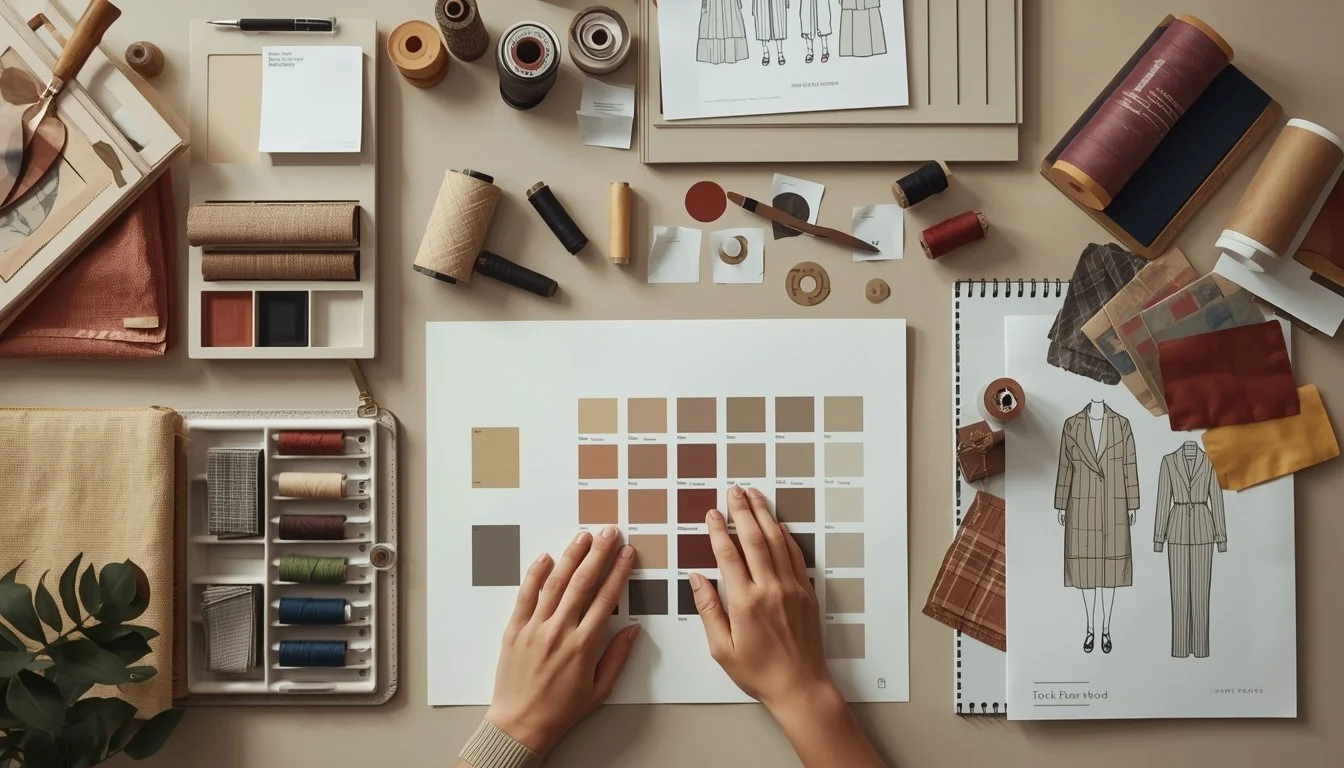
2. Build a Core Palette: Your Visual Anchor
Your core color palette is the backbone of your brand. In fashion color theory, consistency builds recognition.
Typically, you’ll want:
1–2 main brand colors (the instantly recognizable tones—think Tiffany Blue or Nike Black)
2–3 supporting neutrals (your canvas for consistency, like off-white, beige, or charcoal)
1 accent color (a flexible tone you can tweak slightly for each drop)
This palette should rarely change. It’s what helps customers recognize you even if they scroll past your content in half a second.
Example: A sustainable womenswear brand might choose:
Forest Green (primary)
Cream and Sand (neutrals)
Terracotta (accent)
These colors feel organic, elevated, and grounded, matching both the product story and the brand’s tone of voice.
3. Layer Seasonal Palettes: Keep It Fresh, Not Random
Once your foundation is solid, you can start playing. Each drop or seasonal capsule should build on your core palette, not replace it.
Think of it like this:
Core Palette = Your Brand’s DNA
Seasonal Palette = Your Brand’s Mood Board for the Moment
Successful fashion color theory balances trend relevance with long-term brand memory.
When planning your seasonal color stories, consider:
Trend forecasting: Use tools like WGSN, Fashion Snoops, or other trend reports to identify upcoming tones.
Fabric availability: Don’t fall in love with a color you can’t actually produce.
Customer behavior: Check what sold best last season, not just what got the most likes.
You might rotate:
Spring/Summer: Muted pastels, citrus tones, crisp whites.
Fall/Winter: Deep earth tones, burgundy, navy, and warm neutrals.
But always ensure at least a couple of core tones appear across every drop; this keeps your visuals cohesive online and in-store.
4. Create “Color Families” for Product Planning
One of the biggest mistakes new brands make is offering too many colors per style. From a fashion color theory and production standpoint, fewer, intentional colors are more powerful.
A good formula for most startups:
Core range: 60–70% of your products (safe sellers—black, white, beige, navy)
Seasonal tones: 20–30% (trend-driven colors to refresh your collection)
Statement colors: 10% (bold tones that drive PR, photograph fantastically or drive social attention)
This balance helps you appeal to both repeat buyers who love consistency and new customers who want novelty. Think of color like your product mix—anchor it in what’s proven, then layer in excitement where it counts.
5. Test, Learn, and Refine
Color perception varies widely across markets and demographics. A hue that feels “premium” in Europe might read as “cold” in Asia or “clinical” in the U.S. Use data from returns, reviews, and sell-through rates to refine which colors truly resonate.
Use sell-through data, returns, and customer feedback to refine your fashion color theory over time. The best brands treat color decisions as data-backed strategy, not guesswork.
Try A/B testing product photos in different colors, or release micro-drops in limited runs before committing to bulk production.
Over time, your “color data” becomes as valuable as your sales data, showing you not just what looks good, but what sells.
6. Make Color Part of Your Story
The best brands don’t just use color; they talk about it. Explain the meaning behind your palette in campaigns, lookbooks, and product copy.
Example:
“Our new Ocean Capsule draws inspiration from recycled marine plastics; each tone reflects the color journey from sea to shore.”
This creates emotional connection and turns color from an aesthetic decision into a storytelling opportunity.
Conclusion: Strategy Behind Every Shade
Color isn’t decoration; it’s identity, emotion, and trust rolled into one. When fashion color theory is applied with intention—from your core palette to seasonal drops—every product feels like it belongs to the same universe.
It’s not just about what colors you choose, but why they matter. That’s what turns your brand from “just another label” into one your customers recognize and return to again and again.
Need help planning your color palette or aligning your collections with your brand identity? At Tech Packs Co, we help fashion founders translate fashion color theory into cohesive designs, clear tech packs, and scalable systems. Book a consultation today.


Author Bio
Tech Packs Co founder Belinda is a technical fashion designer from London, now based in Los Angeles. Belinda had her first job in fashion at the age of 15, fixing swatch cards together. Since then, Belinda has been designing & creating tech packs for more than a decade... for household name brands and independent designers alike.